

Since starting College, I was told that being able to show off your work is important and being able to do at any moment is the best way to get a job. I think it was common knowledge around students that you could kill solve two issues in one by creating a personal website. Yes, a portfolio can show that you know how to not only get a website online but also that you know web technologies like HTML, CSS and Javascript.
So in August of 2018, after exams were completed for the summer semester, I created my first website. I had co-op term quickly approaching (Jan 2019) and wanted to pull something together before the next semester started.
My First Website
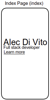
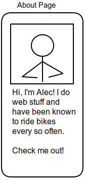
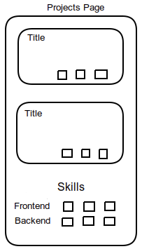
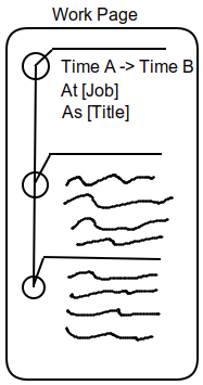
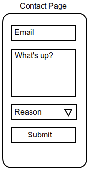
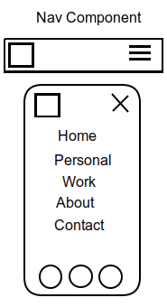
Knowing that planning was best to do before programming, I first set my eyes on creating mockups of how I'd want my app to look. Sadly though, I'm not a designer. Instead of creating beautiful mockups in Figma (what I should have done), I pulled up Microsoft Paint and threw my ideas onto the blank canvas like a struggling artiest.
The result?
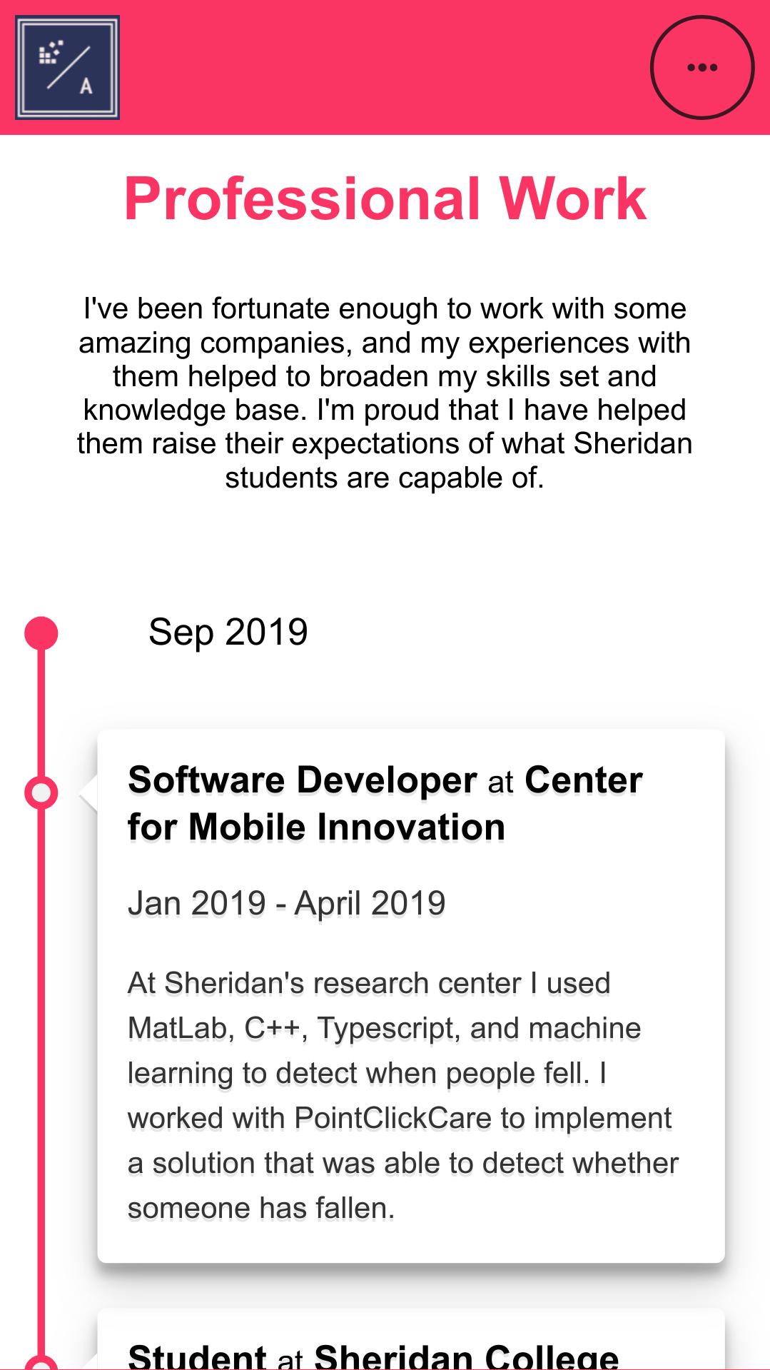
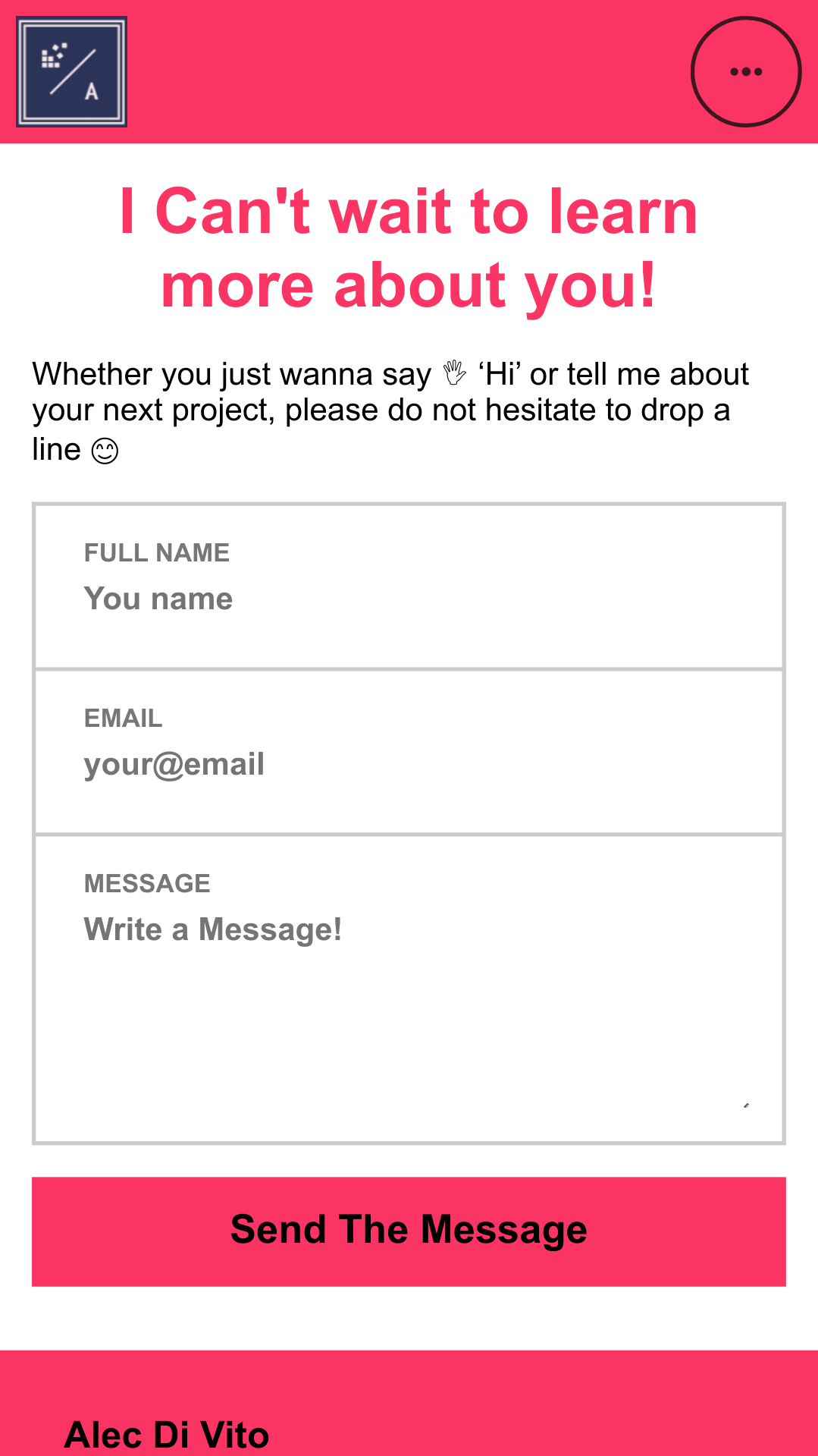
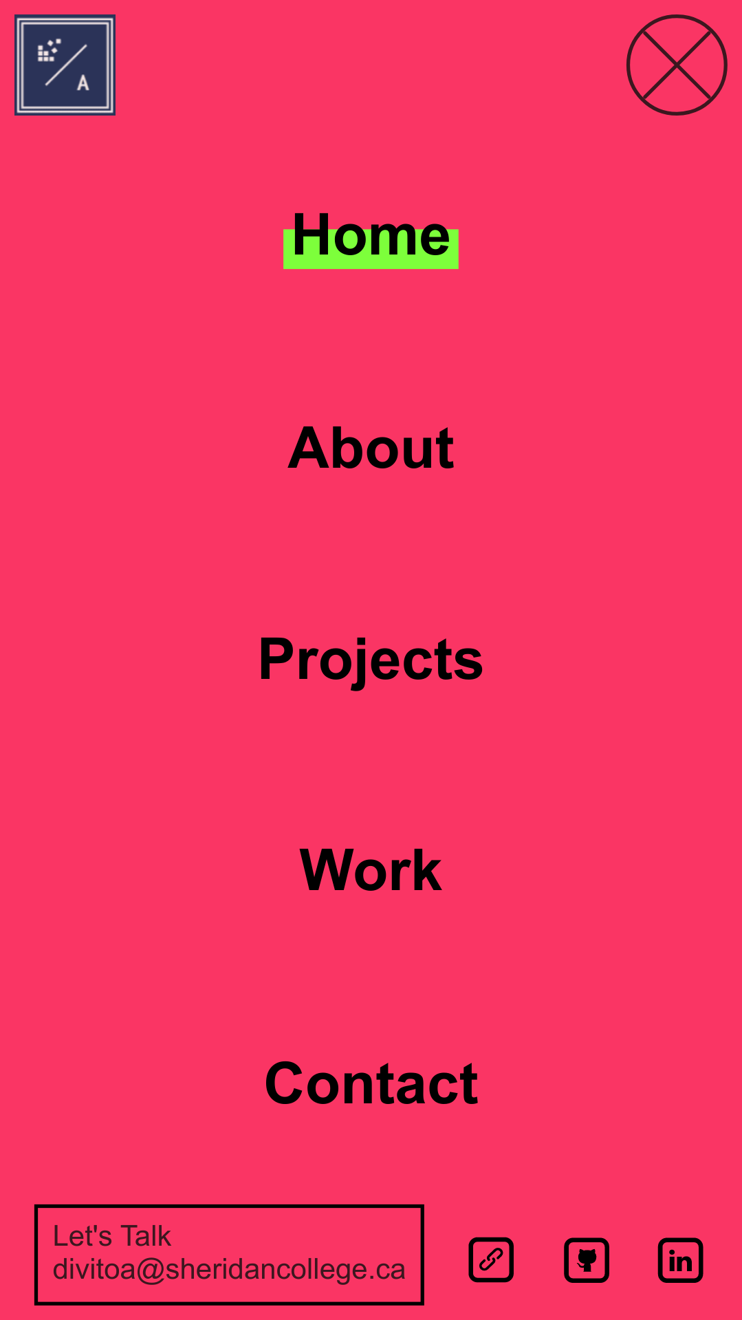
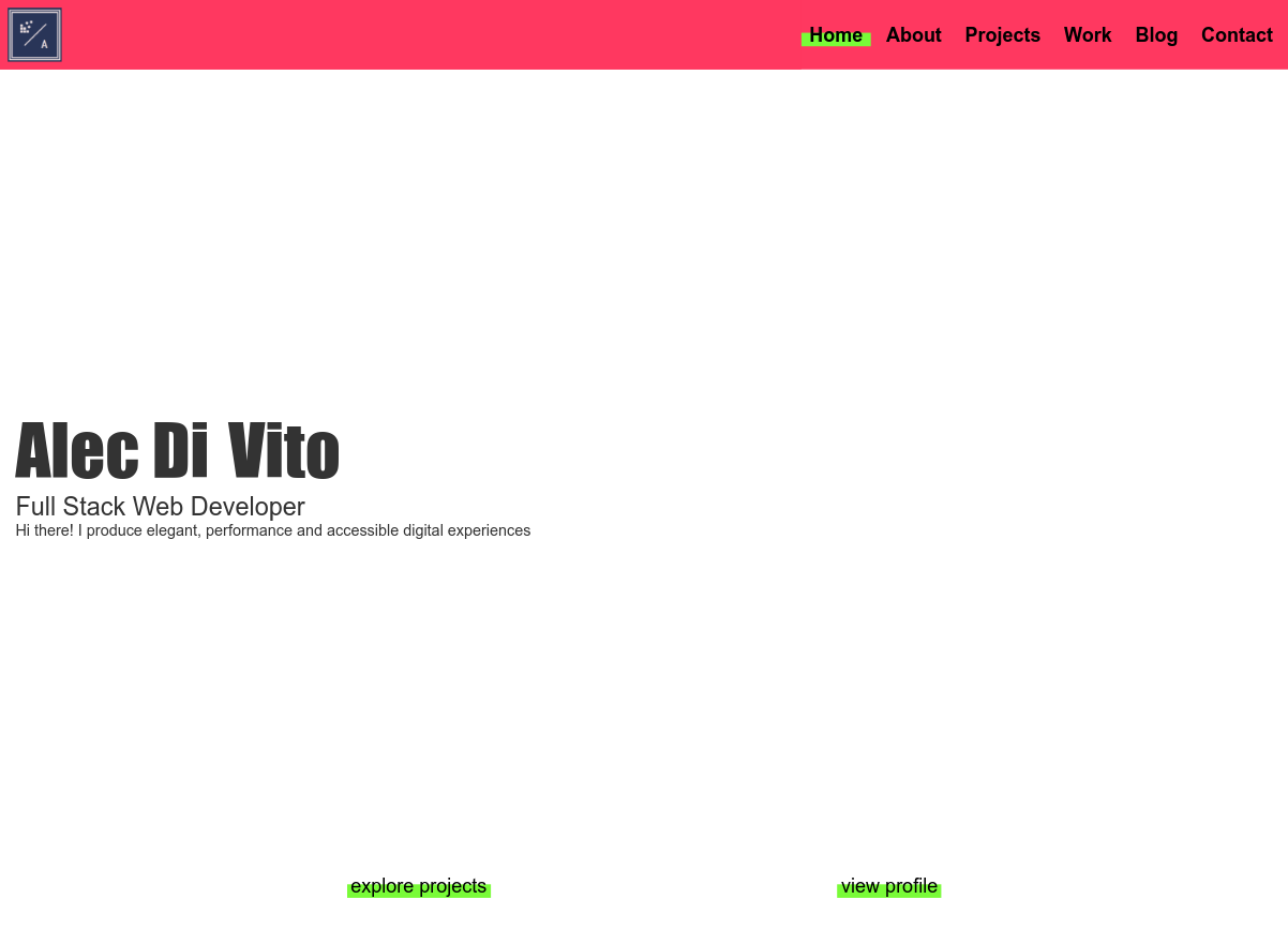
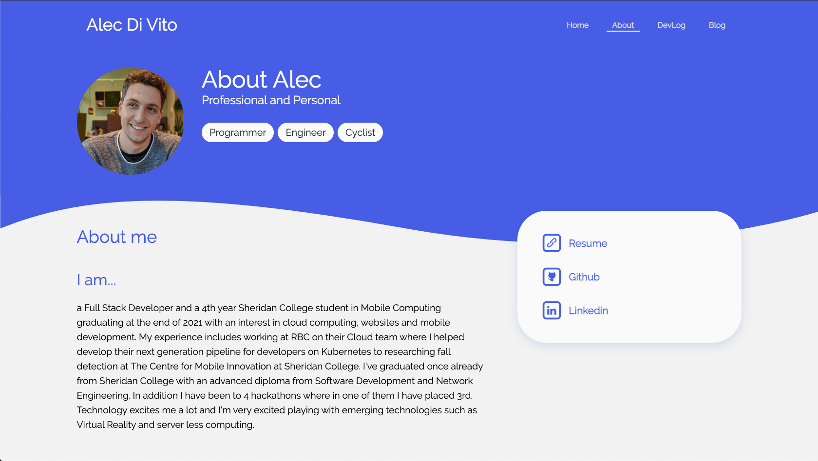
6 pages to show off different things about me. Project's I've worked on, professional information on me and the ability to contact me. During this time, mobile first design was BIG (and it probably still is) so I focused on creating a mobile site first.
Technologies
I reviewed many technologies before setting on Gatsby. Gatsby, if you don't know, is a static site generator, meaning it renders all/most of your pages as static HTML (not really for Gatsby, but I digress). It's also designed to use React which was getting big (and is now HUGE). I already knew angular, so choosing it felt like a good idea.
Javascript was used instead of my usually choice of Typescript for the first version of the site. This was because it was my first project using Gatsby and I didn't find out there was a plugin that allowed me to compile the project with typescript.
To style my React components, I didn't have CSS-in-JS so I settled on using SCSS. I had just learned about how people had very strong opinions on how to organize your CSS classes. One such way is using the BEM methodology. I'm pretty sure I used it because it was simpler to understand then something like Atomic Design.
Execution
With framework and CSS methodology in hand, I got to work implementing my design. I wanted to make quick progress, which led me to pick a simple colour palette. This allowed me to just focus on the content rather then the design.
Without consulting any friends or family, I whipped up a sweet looking website. At the time I thought the designs looked great and every element I added made the site look better and better.

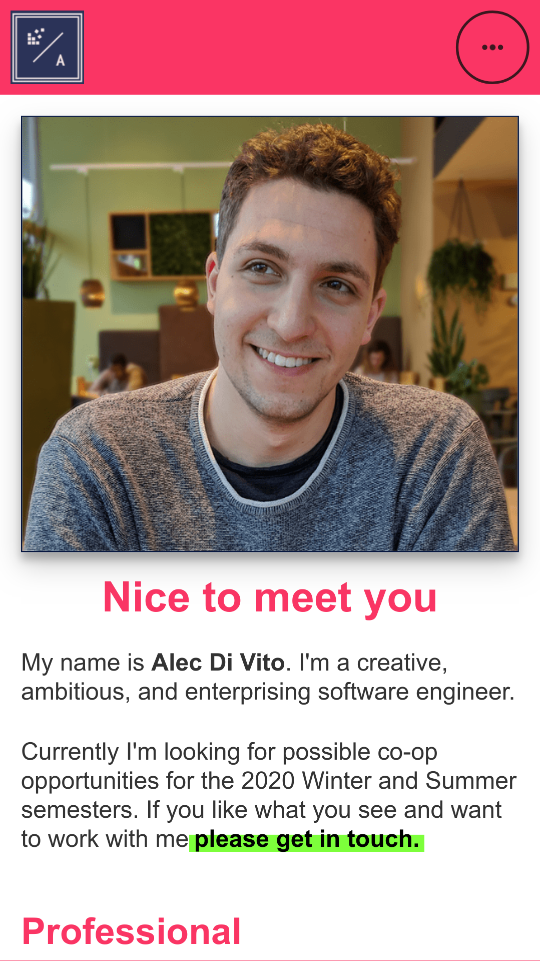
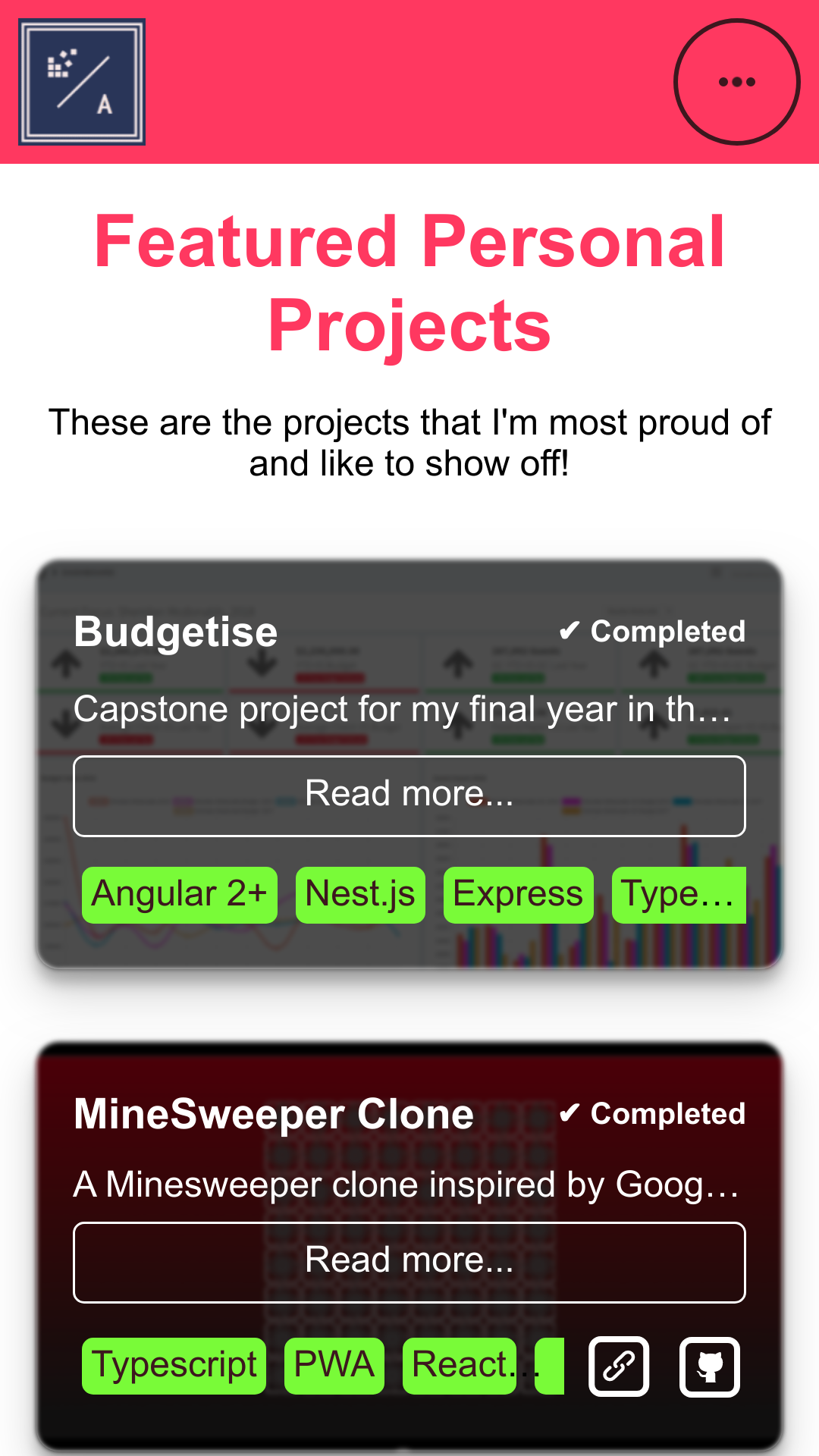
Overall, I was pretty impressed! Over joyed that I was able to plan, design and implement my website.
With the finished product in hand, I went to programmer friends to show off my new creation. They were impressed. Designers on the other hand were not. When allowing designer peers to review my site some of the comments I received were the following
2. The colours are too bright
3. Why is there snow falling on the index page
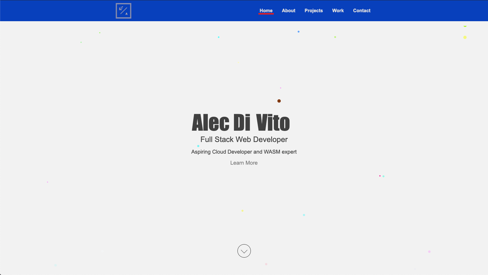
With feedback in hand, I thought about how I could address it. I still liked the design so I decided to keep the majority of it but I knew that at the very least, the colours need to change. This is what came up with.
Primary colours
Accent colours
Shades
There were also other minor edits, but they aren't worth bringing up here, as you'll see, design number two was a big change.
Transition to version 2
Improving on design and getting some help from a professional
During the year's my first site was active I got many comments on the design. Most of them were that the colours that I used were very very saturated. I also learnt that some of the layouts weren't very nice, especially on desktop.
I wanted to go out and solve it, once and for all. With new found motivation, time and listening skills, I got to work actually designing a new UI that would be able to stand the test of time.
I got another friend to help me mock up a design in Figma. I took "inspiration" from 2 websites
After the research was done and we knew roughly what we wanted, we started prototyping and iterated through a couple of new designs for the landing page.
After iterating over a handful of prototypes we finally found one design we both liked and started copying information from my current website over to provide more of a concert look and feel over a couple of different pages.
Once the mocks were complete, I was able to start programming and implementing the design. Once complete, I decided it was time to compare some pages from old pictures I had to the new website design.
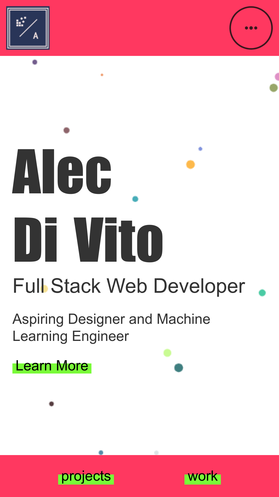
Phone Home Page
Desktop Home Page
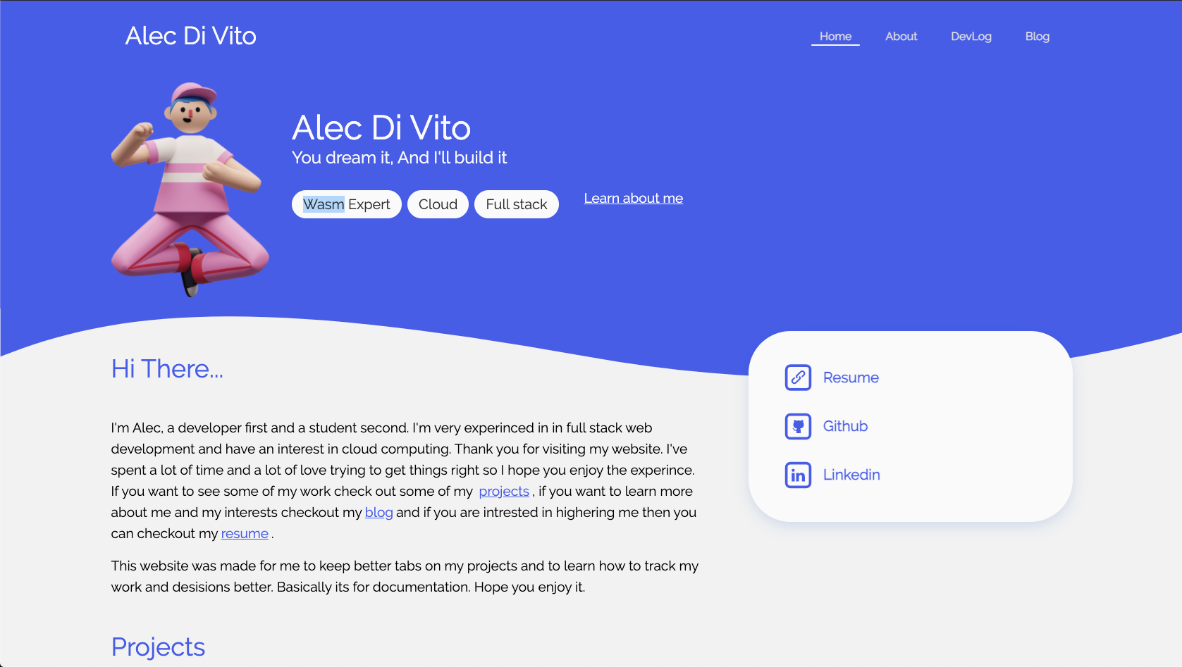
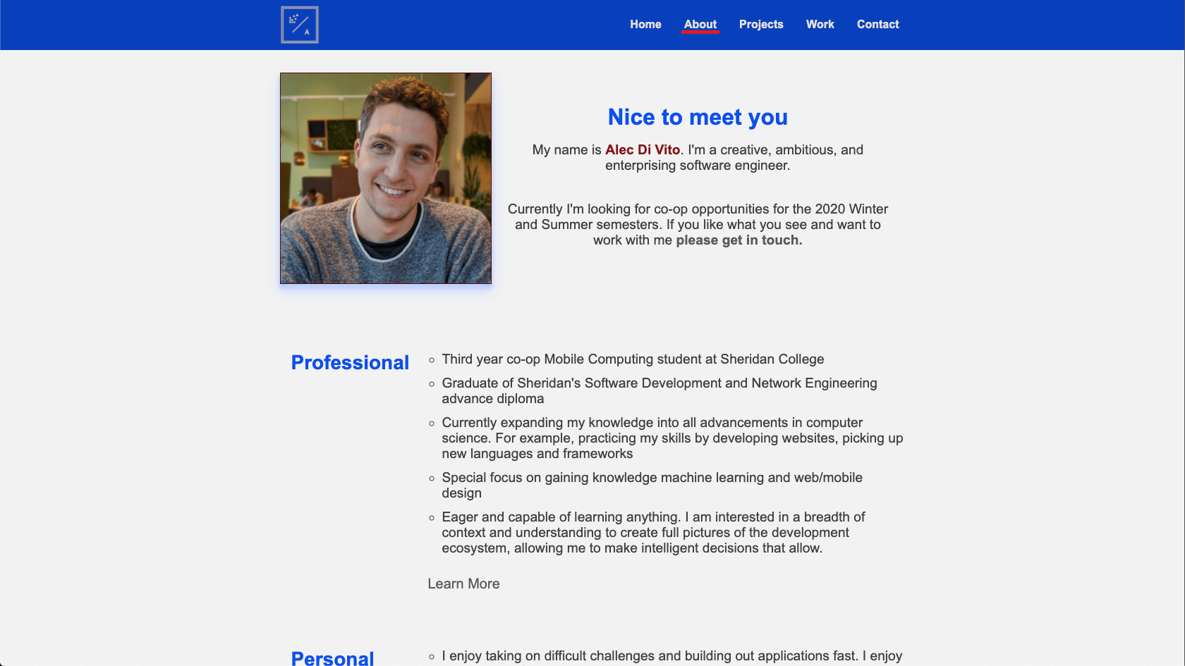
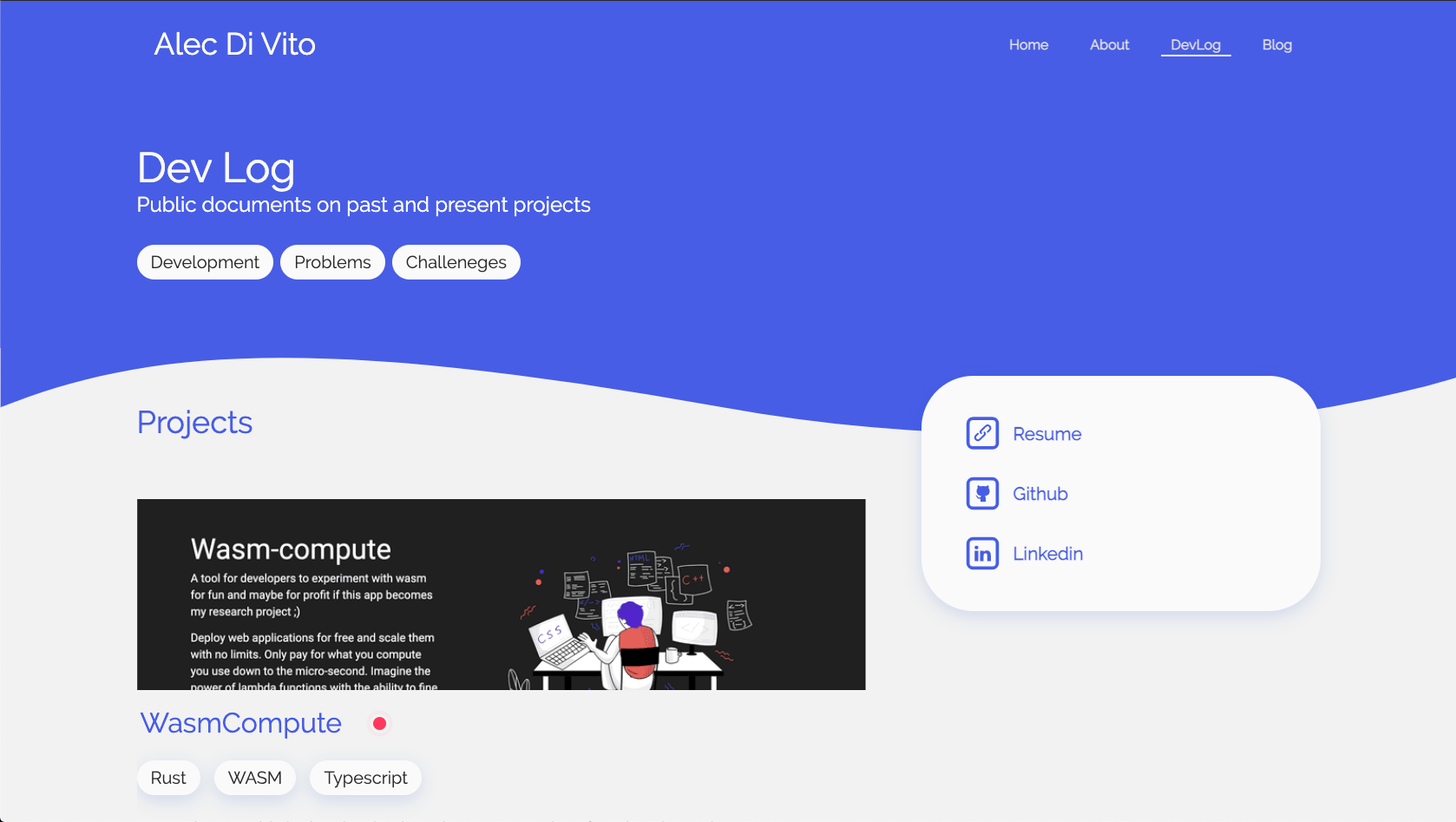
Desktop About Page
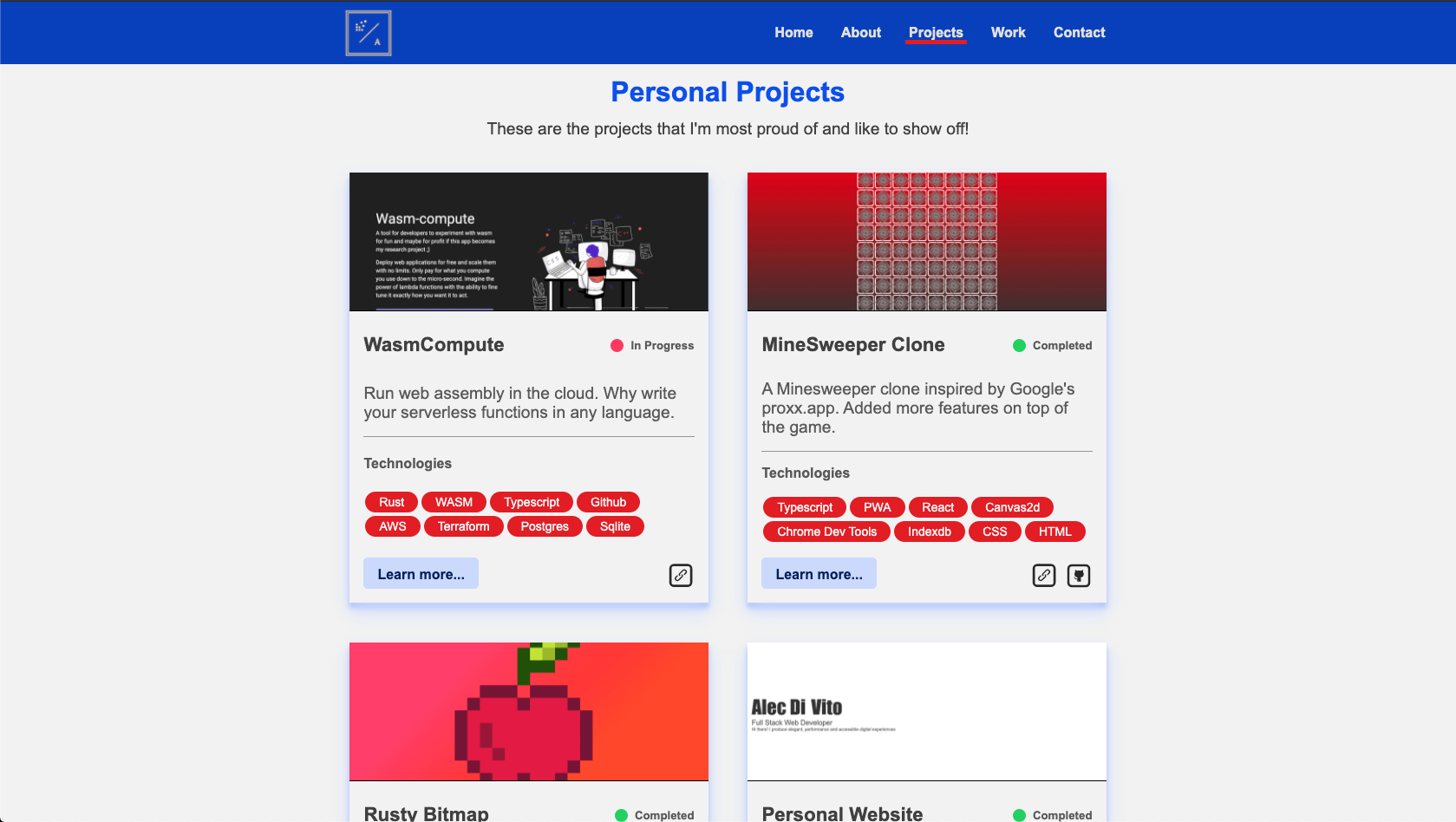
Desktop Project Page
I was really happy with the result and thought that this was it. However, one thing was nagging me. I hated updating the damn thing...
Transitioning to V3
Oh really, another website update 👏
After 6 years of maintaining my Gatsby portfolio, I finally called it quits.
The reason?
Maintaining Gatsby over the years was a nightmare. I think that while I was using it, it went through 2 major version bumps. It was not un-common for me to go back to it after a year to add a job experience, just for it to not build. I lost a couple of days trying to track down why my mdx integration wasn't working.
But that wasn't it.
At this point, I had entered the professional work force. I'd had joined RBC and started maintaining a HomeLab at home. My priorities were shifting from just having a portfolio to instead wanting to maintain a blog. With the fact that Gatsby was hard to maintain, a nightmare to write content for, and not fun to use, I looked for a different solution.
To guide my search, I set clear priority, as this was the last time I wanted to spend time on maintaining a custom website.
- Had to have pre-made themes and be customizable
- Had to be easy to host at home (on my Kubernetes cluster, duh)
- Most importantly, it had to be fun to use
And although there are many blogging solutions out there, only one does it the best.
Choosing Ghost
And the best would be Ghost. A backend hosted blog platform that has many themes, which you can self host and provides an in-browser article editor. It hit all my points so over the course of one weekend, I stood it up and moved all my content over.
It was super easy, mostly because my last portfolio had very little content on it because I hated updating it.
Ghost has definitely been a learning experience, but I love the fact that I don't need to do all my work in a text editor and re-build my app all the time. Instead, I just let Ghost do all of that for me and I can focus on what really matters, which is writing content.
But, I couldn't resist a lil redesign...For fun and research...
Creating my own theme
If you want to use my theme, feel free to pick it up.
 AlecDivito
I always wanted to make my own theme, and on Feb 2026, I left RBC for Amazon and had a 2 week break to put a nice new coat of paint on the portfolio. Now with more then a decade of programming I knew what I needed to do.
Just get the portfolio done, cut scope and create a system for making content first and iterative updates over time.
The result is the following, what you are reading, a basic, only dark mode website that shows off my projects and blog posts.
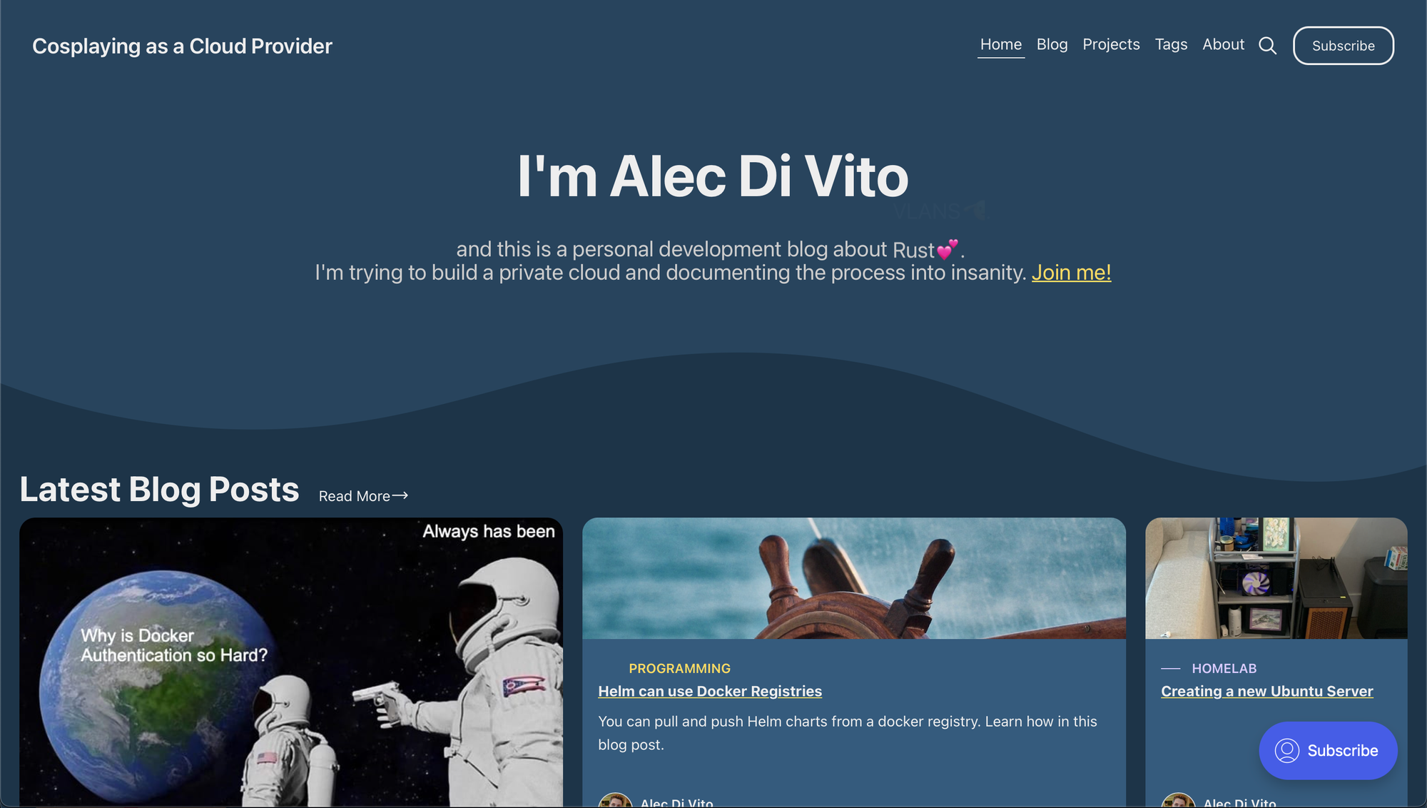
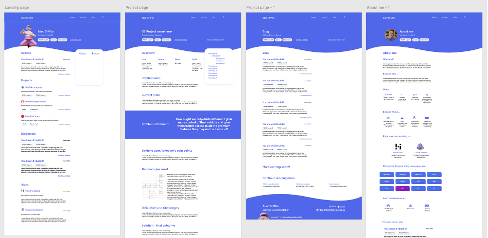
A look at different pages from around my blog
Final Thoughts
Looking back over the designs and hours working
Overall, a lot of my past websites were unsuccessful from my primary goal which was to be easy to update and add content to. Turns out choosing Gatsby was the wrong idea, although maybe that was just picking javascript as a whole 🤷♂️.
Over the 5 years I used Gatsby, I found it difficult to update packages and towards the end, I found it was impossible to migrate my website to newer versions of Gatsby. I got to the point were I just build my site locally and manually push my changes to GitHub pages.
Keeping data in md, mdx and json isn't really that great or user friendly. Even for a developer like myself. It's much nicer to have a GUI that doesn't have to deal with Git. I've now switched my personal website to Ghost (the website you are reading this on) and overall, the experience is much better. I'm in the process of bringing some of the designs from my other portfolios over to my custom theme here.
With Ghost, the content and the design are separate. This has allowed me to focus on creating content and design separately. As I continue to add more content, I can get a better feel for how every post should look which makes it easier to come up with my own design. Follow the development of this website by following the repository below.
Thanks for reading my article about the life my portfolio has had over the years. I hope it never has to have any major changes every again!